Markets have started 2016 on a sour note: but a sense of perspective is helpful (as always).
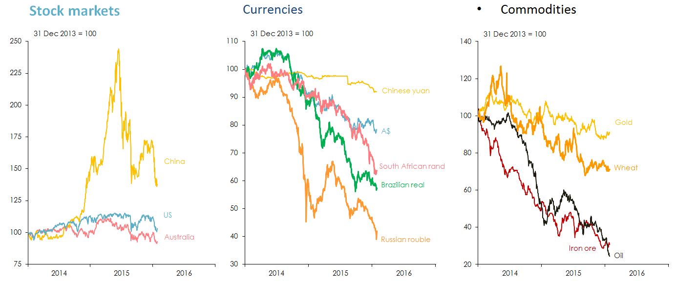
Figure 1: Market trends from 2014-2016. Souces: Thomson Reuters Datastream.
The collapse in oil prices is (mostly) a supply-side story.
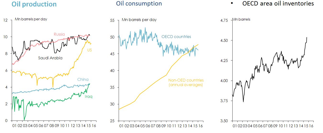
Figure 2: Measures of oil supply and demand from 2001 - 2016. Note: 'OECD' refers to Organization for Economic Co-operation and Development, a grouping of 34 (mostly 'advanced') countries. Sources: US Energy Information Administration; Organisation of Petroleum Exporting Countries (OPEC).
So is the decline in iron ore prices.
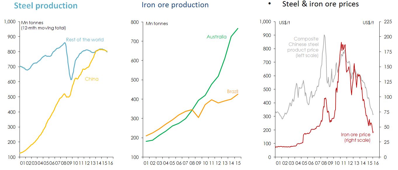
Figure 3: Measures of iron ore supply and demand from 2001 - 2016. Sources: World Steel Association Office of the Chief Economist, Australian Department of Industry, Science and Innovation, Mysteel Thomson Reuters Datastream.
The global economy
The US recovery has reached a point where it no longer needs to be supported by ‘free money’.
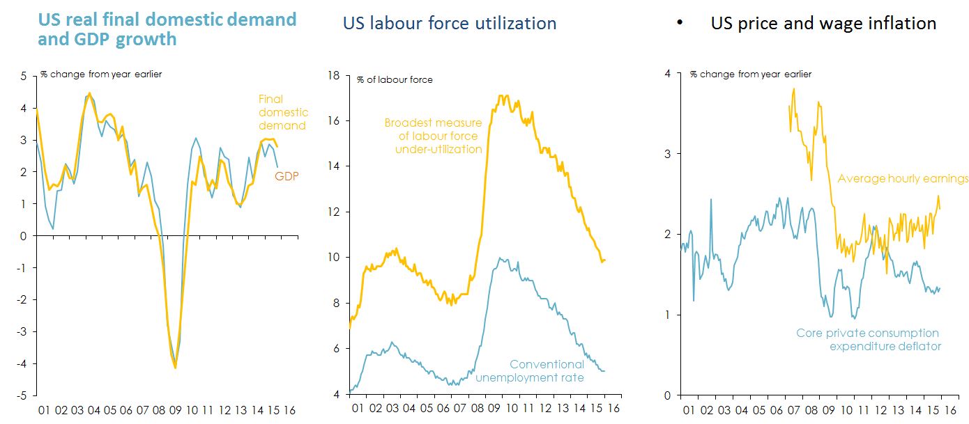
Figure 4: Indicators of US market recovery. Sources: US Bureau of Economic Analysis; Bureau of Labor Statistics.
The euro area economy is now improving gradually – but unemployment remains very high, and inflation worryingly low.
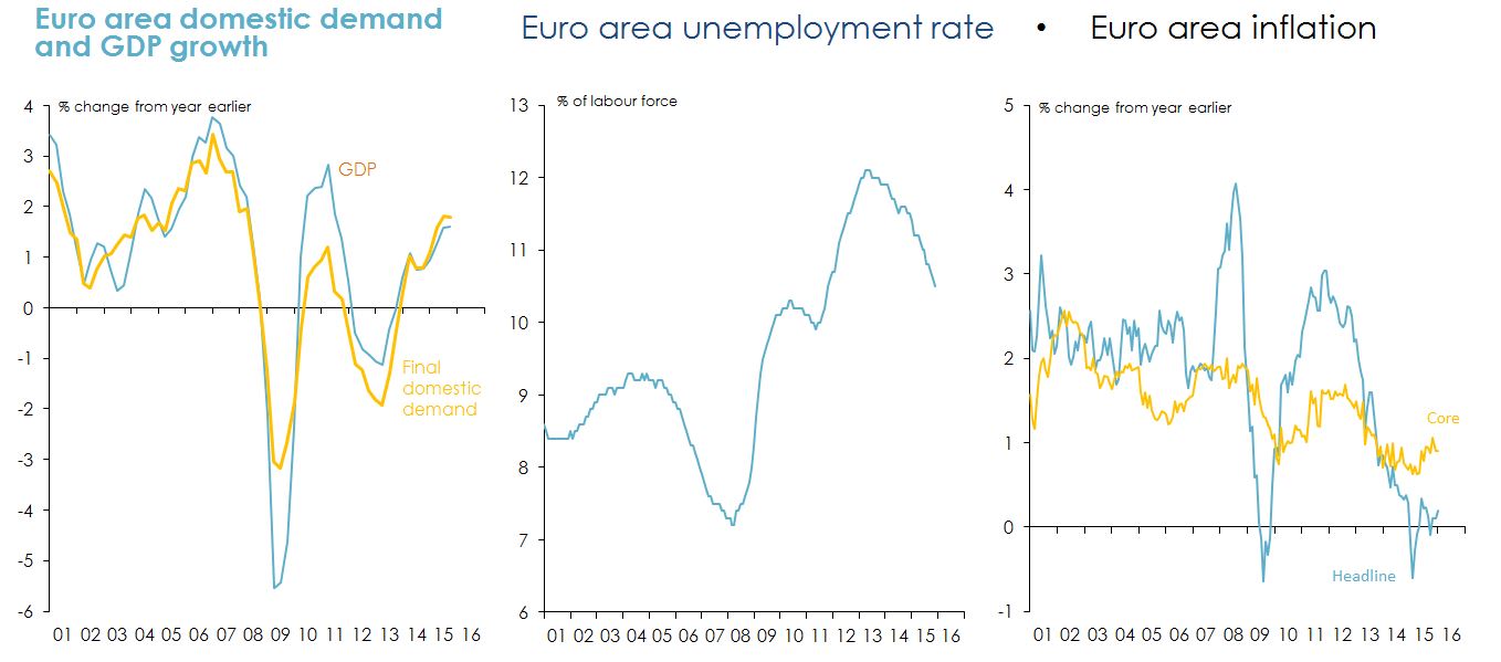
Figure 5: Indicators of European market health. Source: Eurostat.
Japanese Prime Minister Abe’s ‘three arrows’ are yet to underwrite a sustained expansion in the Japanese economy or put an end to deflation.
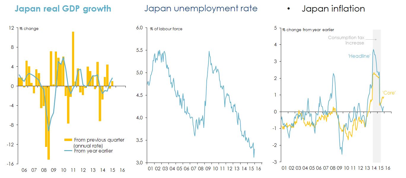
Figure 6: Indicators of Japanese market health. Source: Japan Cabinet Office; Japan Statistics Bureau.
Monetary policy divergence among the ‘big three’ industrialised economies will continue to drive exchange rates.
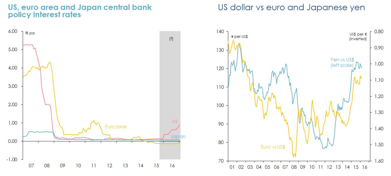
Figure 7: Monetary policy divergence among the US, European and Japanese economies. Souces: US Federal Reserve; European Central Bank; Bank of Japan; Thomson Reuters Datastream.
‘Emerging’ markets are experiencing a growth slowdown, and some could be vulnerable to financial instability as a result of rising US rates.
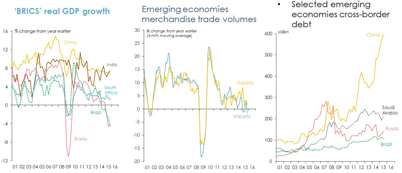
Figure 8: Indicators of growth of emerging markets. Note: 'BRICS' is Brazil, Russia, India, China and South Africa. Sources: China National Bureau of Statistics; India Central Statistical Office; Russia Federal State Statistics Service; Instituto Brasileiro de Geografia e Estatistica; Statistics South Africa; IMF; Netherlands Bureau for Economic Policy Analysis (CPB); Bank for International Settlements (BIS).
China’s economic growth rate is slowing – and the ‘mix’ of Chinese growth is changing.
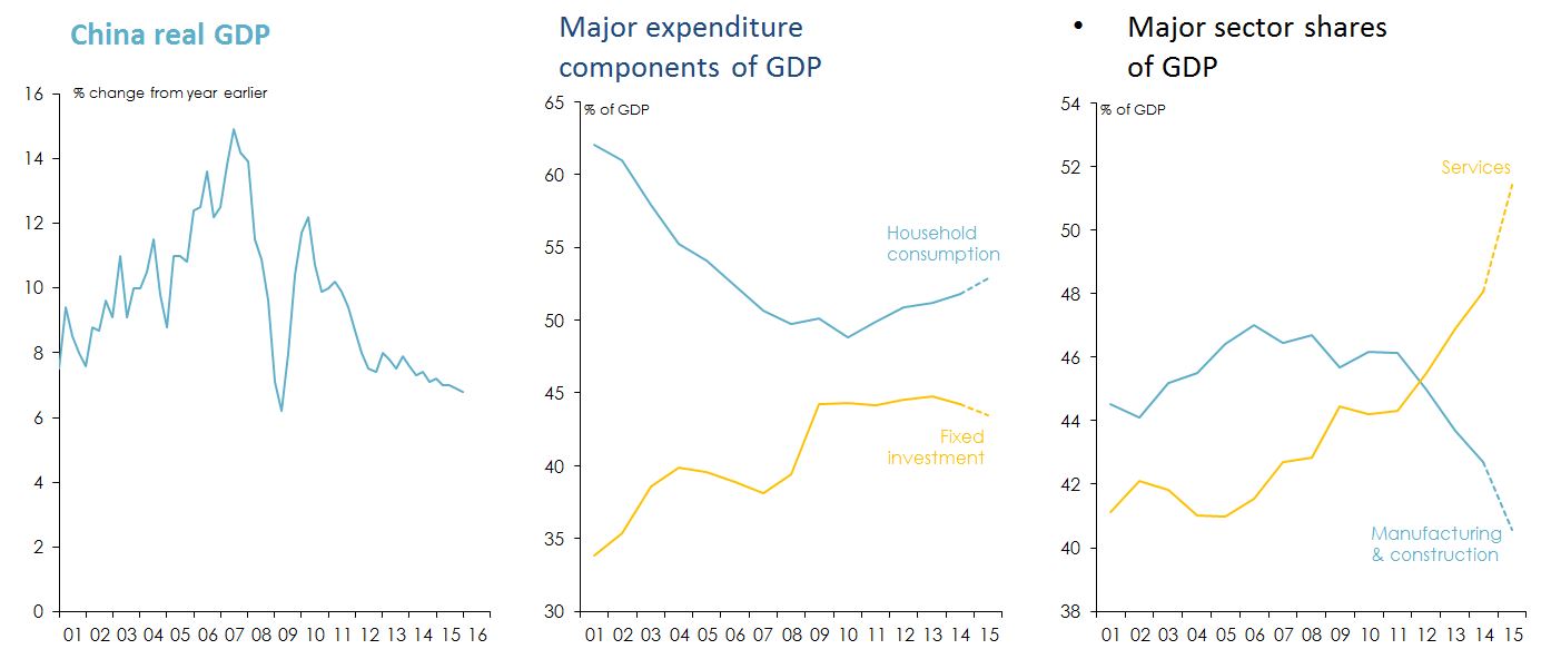
Figure 9: Indicators of China’s market health. Source: China National Bureau of Statistics (NBS). 2015 figures for expenditure and industry shares of GDP are estimates.
Chinese workers aren’t so cheap any more: and there will be fewer of them from now on.
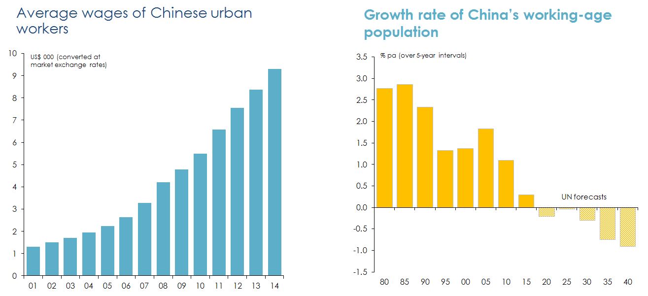
Figure 10: Wages and growth rate of China’s workers. Sources: China National Bureau of Statistics; United Nations Economic and Social Affairs Division, Population Prospects; author's calculations.
Markets have lost their previous confidence in the Chinese authorities’ ability to control just about everything.
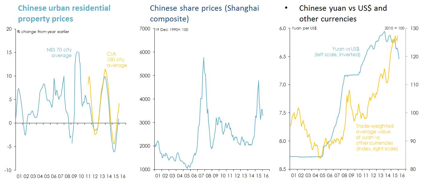
Figure 11: Movement in indicators of China’s market from 2001 - 2016. Sources: China National Bureau of Statistics (NBS); China Index Academy (CIA); Thomson Reuters.
China now has very high levels of debt, especially in its corporate sector.
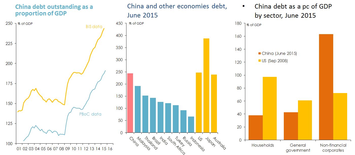
Figure 12: Level of China’s debt. Sources: People's Bank of China (PBoC); Bank for International Settlements (BIS).
Capital outflows appear to be putting substantial downward pressure on China’s exchange rate.
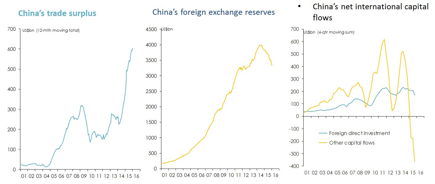
Figure 13: Pressure on China’s exchange rate.Source: China Customs Information Centre; People's Bank of China. 'Other capital inflows' calculated as the difference between the current account surplus and the sum of the capital account balance, net foreign direct investment inflow and net change in official reserve assets.
India has the potential for faster economic growth than China over the long term.
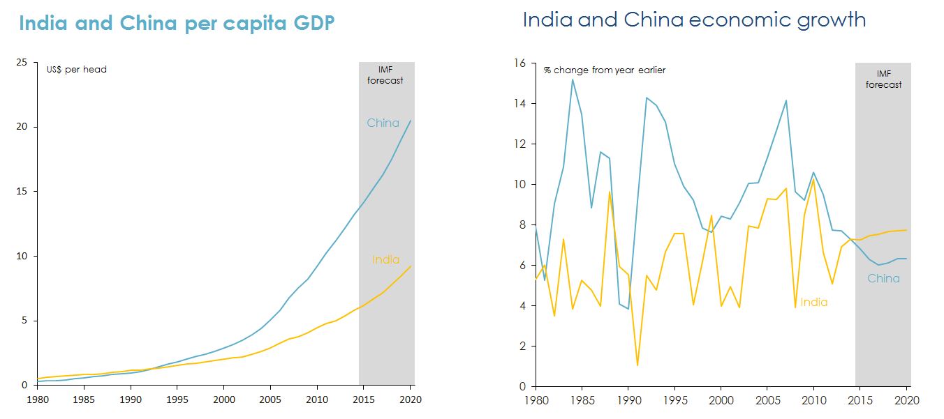
Figure 14: India versus China in relation to economic growth. Source: International Monetary Fund World Economic Outlook October 2015.
India’s demographic profile is much more conducive to rapid economic growth than China’s.
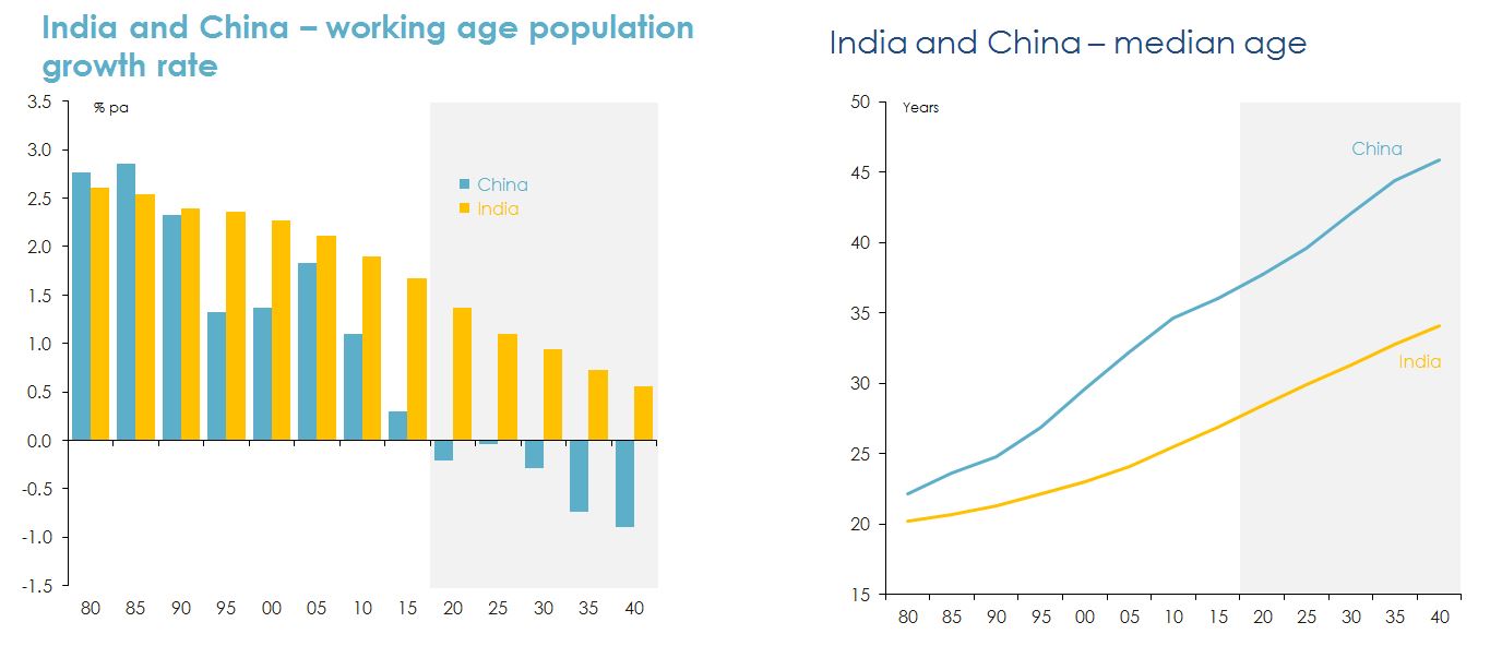
Figure 15: Age of India’s work force compared with China’s. Source: United Nations Economic and Social Affairs Division, Population Prospects.
But on most other ‘fundamental’ indicators of development prospects, India is less well placed than China.
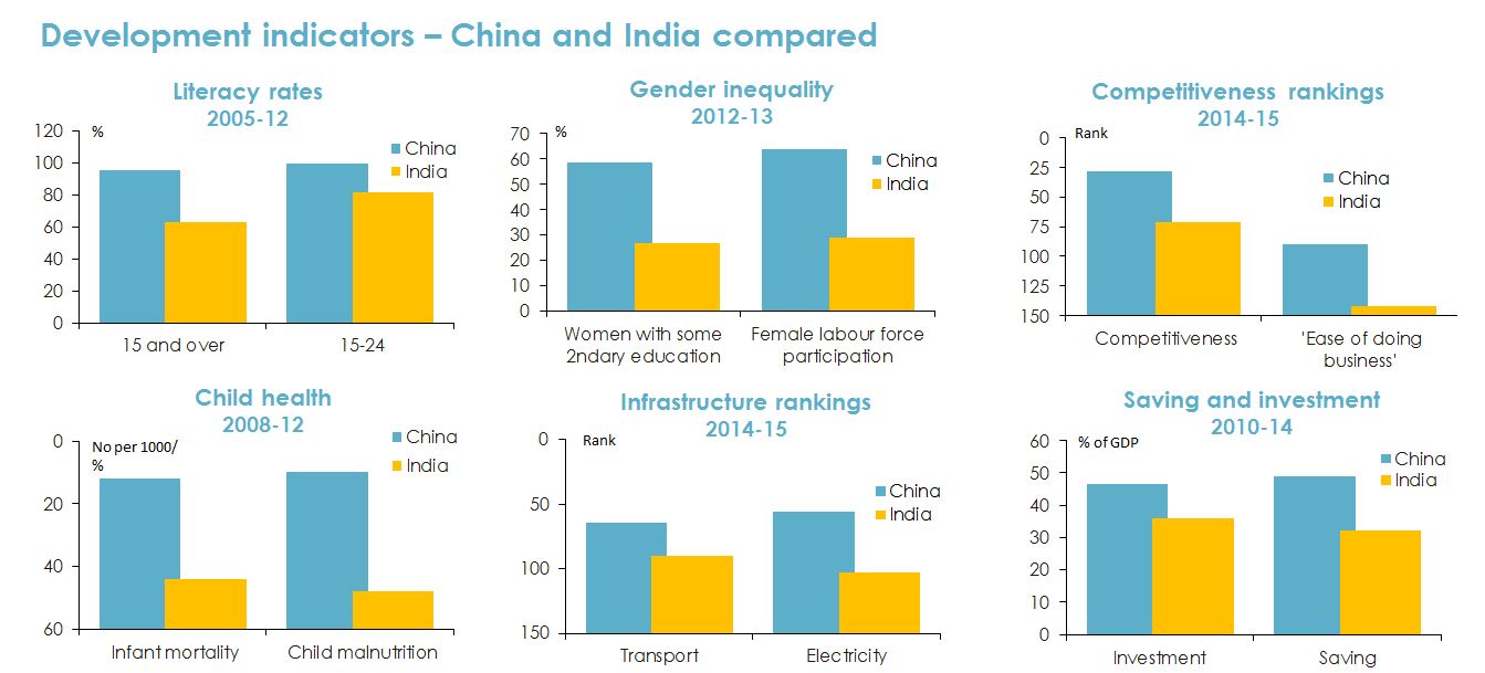
Figure 16: Development indicators of China versus India. Sources: United Nations Human Development program, Human Development report 2014; World Economic Forum, The Global Competitiveness report 2014-15; The World Bank, Doing Business 2015; International Monetary Fund, World Economic Outlook October 2015.
The Australian economy
Australia probably derived more benefit from Chinese growth and industrialization than any other nation
on earth.
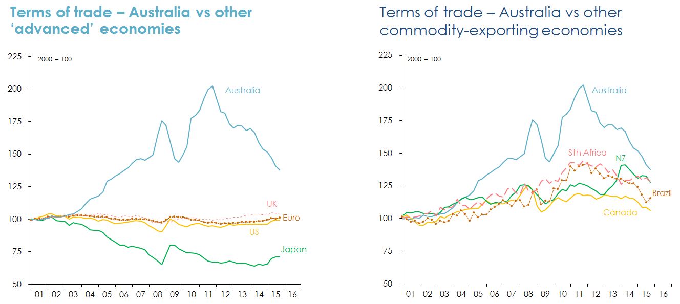
Figure 17: Response from Australia due to Chinese growth and industrialisation. Note: The 'terms of trade' is the ratio of the implicit price deflator of exports of goods and services to the implicit price deflator of imports of goods and services. Sources: ABS; US Bureau of Economic Analysis; Eurostat; UK Office for National Statistics; Japan Economic and Social Research Institute; Statistics NZ; Statistics Canada; Statistics South Africa; Instituto Brasileiro de Geografia e Estatistica; author's calculations.
The resources investment boom is over – and while resources exports are rising, they are at falling prices and don’t employ as many workers.
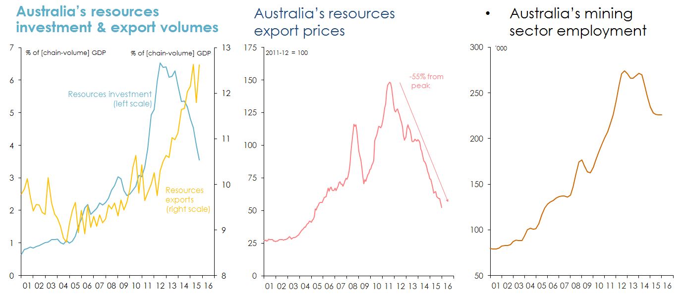
Figure 18: Indicators of health of Australia’s resource market. Note: Resourses investment includes exploration expenditure. Source: ABS.
Australia has experienced sub-trend growth, declining real per capita incomes and rising unemployment since commodity prices peaked.
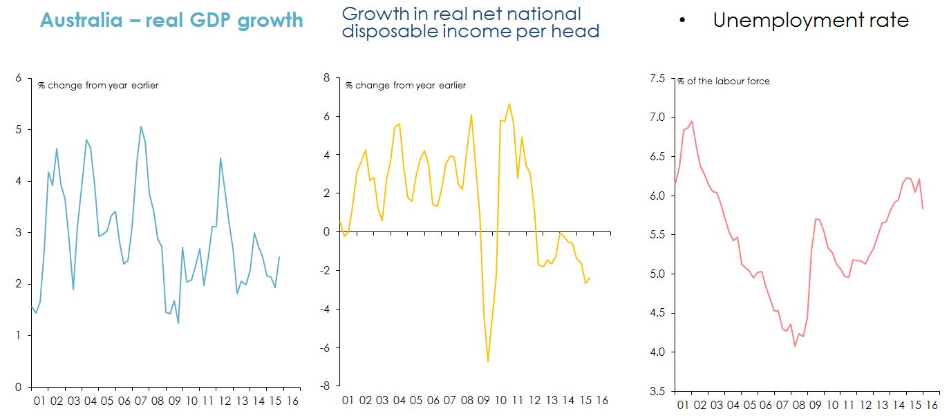
Figure 19: Response of growth, income and employment since commodity prices peaked. Note: Real net national disposable income (NNDI) is real GDP adjusted for changes in the terms of trade, minus net factor income and transfer overseas, minus depreciation. Source: ABS.
Australia is relying on record-low interest rates and a (now) below-its-long-term-average Australian dollar to support economic growth.
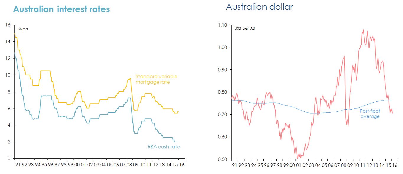
Figure 20: Interest rates and Australian dollar from 1991 to 2016. Source: Reserve Bank of Australia.
Record-low interest rates stimulated a substantial rise in housing demand, housing prices and (eventually) housing supply.
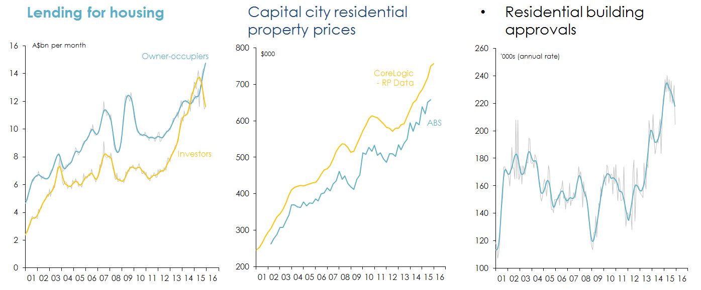
Figure 21: Measures of housing supply and demand. Note: grey lines in the first and third charts above show seasonally adjusted data; thicker coloured lines are the ABS 'trend estimates'. Sources: ABS; CoreLogic - RP Data.
Australia now has relatively high residential property prices (by international standards) and very high levels of household debt.
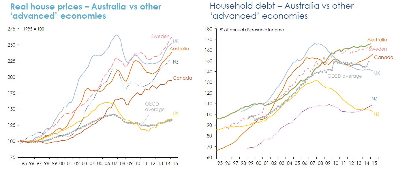
Figure 22: Australian property prices and household debt relative to other countries. Note: OECD average for household debt to income ratio based on a limited number of countries. Source: International Monetary Fund. Australia: Selected Issues. Country Report No. 15/275 (September 2015). p.4.
Overseas experience suggests that housing ‘busts’ occur when demand declines abruptly after an extended period of rapid growth in supply.
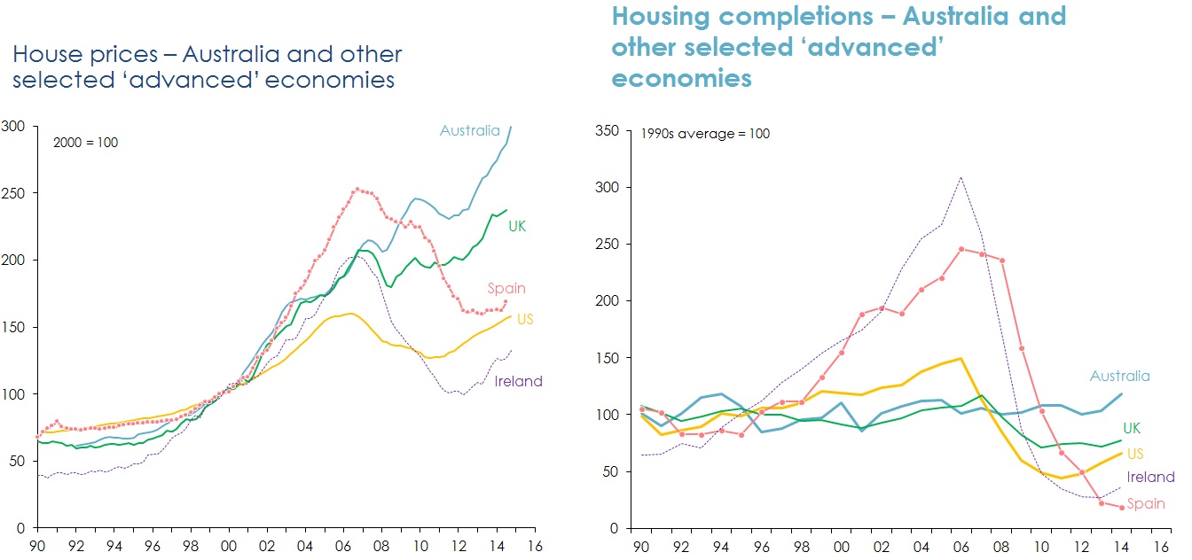
Figure 23: Will Australia experience a housing ‘bust’? Sources: ABS; US Commerce Department; UK Office for National Statistics; Eurostat; CoreLogic; S&P; Bank for International Settlements.
The supply-demand balance in Australia’s housing market is likely to change quite significantly over the next three years.
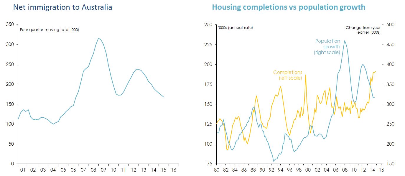
Figure 24: Expected supply and demand for housing over the next three years. Source: ABS.
The fall in the A$ has had a substantial influence on the tourism and education sectors.
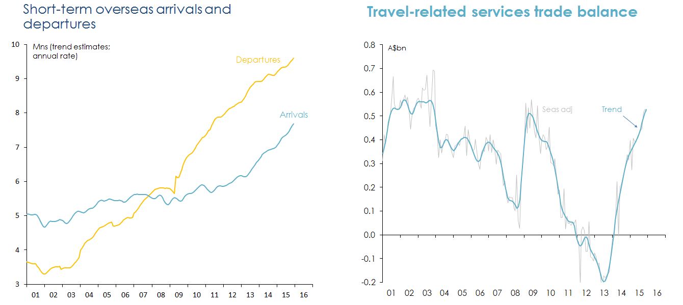
Figure 25: The effect of the Australian dollar on tourism and education sectors. Note: 'travel-related services' includes accommodation, transport and food services provided to foreign students as well as tourists. Source: ABS.
It’s possible that last year’s change in political leadership could have a meaningful (positive) effect on business and consumer confidence.
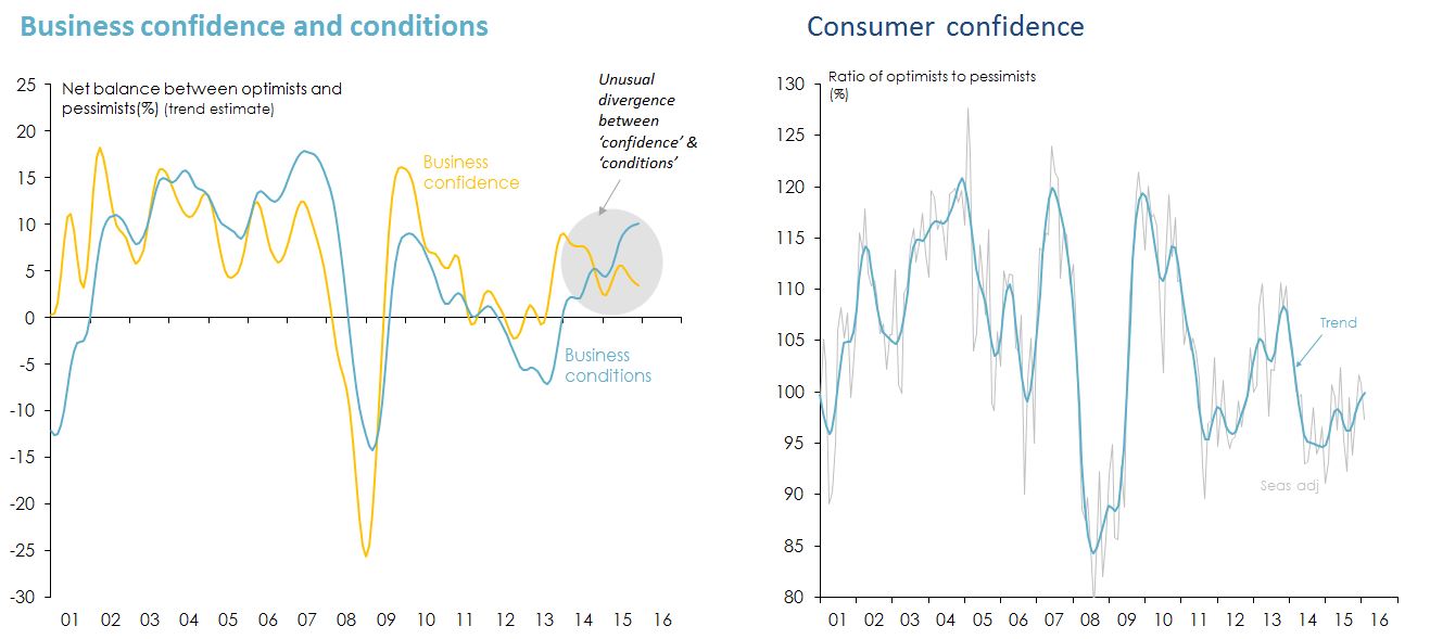
Figure 26: Effect of change in political leadership on business and consumer confidence. Source: National Australia Bank Monthly Business Survey; Westpac-Melbourne Institute.
Improved business confidence would help lift non-mining business investment - infrastructure investment would help too.
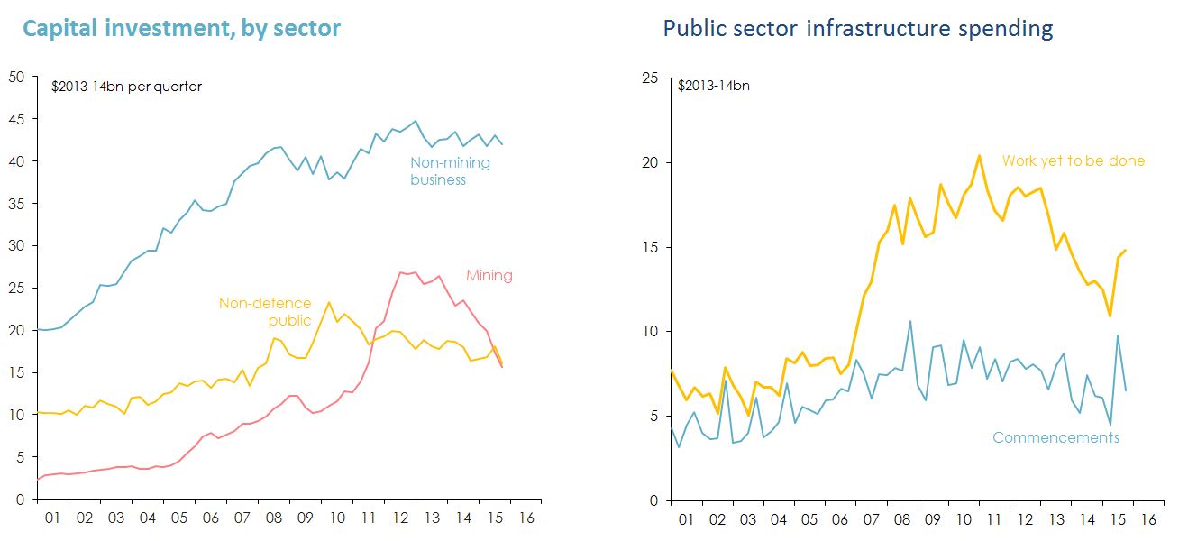
Figure 27: Effect of business confidence on investment in infrastructure. Note: Public sector infrastructure spending includes work done by the private sector for the public sector. Source: ABS.
Household and business services sectors are doing well; goods-producing and distribution sectors (mining and non-mining) are struggling.
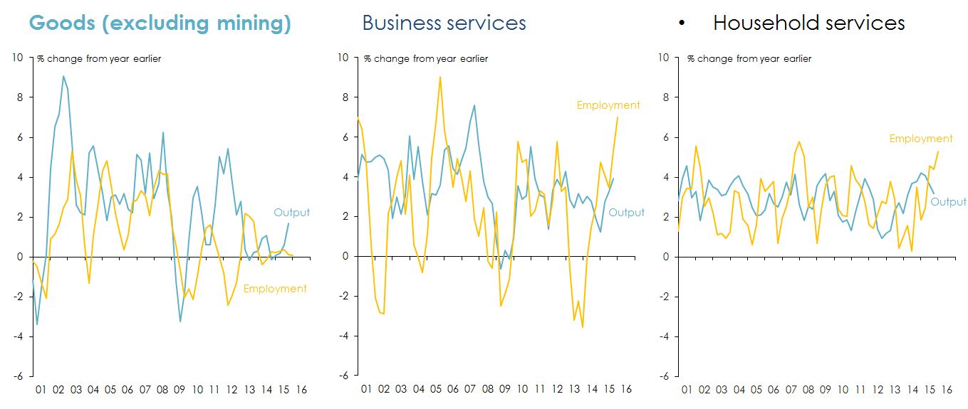
Figure 28: Health of the Australian household and business service sectors. Note: 'Goods' sector includes manufacturing; electricity, gas, water and waste services; construction; transport, postal and warehousing; wholesale trade; and retail trade. 'Business services' includes professional, scientific and technical services; finance and insurance; administration and support services; rental hiring and real estate services; and information media and telecommunications. 'Household services' includes accommodation and food services; education and training; health care and social services; arts and recreation; and other services. Not includes are agriculture, forestry and fishing; mining; and public administration and safety. Source: ABS.
Because the (growing) services sectors are more labour-intensive than (struggling) goods-producing sectors, employment growth has picked up.
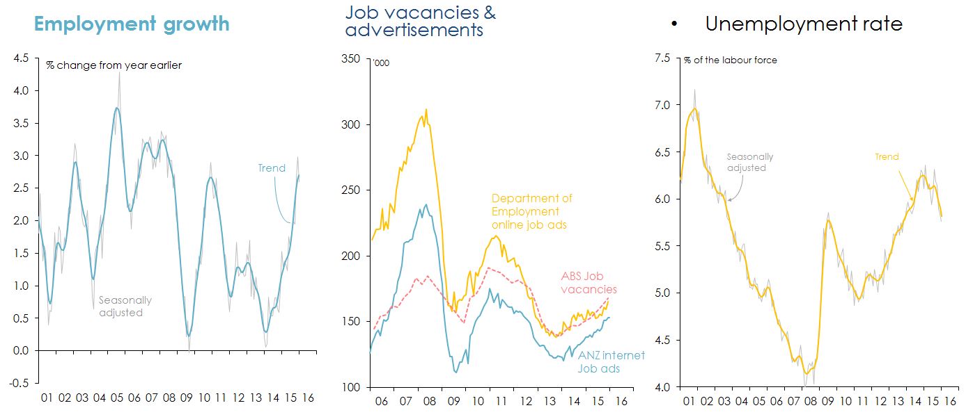
Figure 29: Growth in employment. Sources: ABS; Australian Government Department of Employment; ANZ Bank.
Household income is growing much more slowly than before the financial crisis and peak in the terms of trade – and households are saving more.
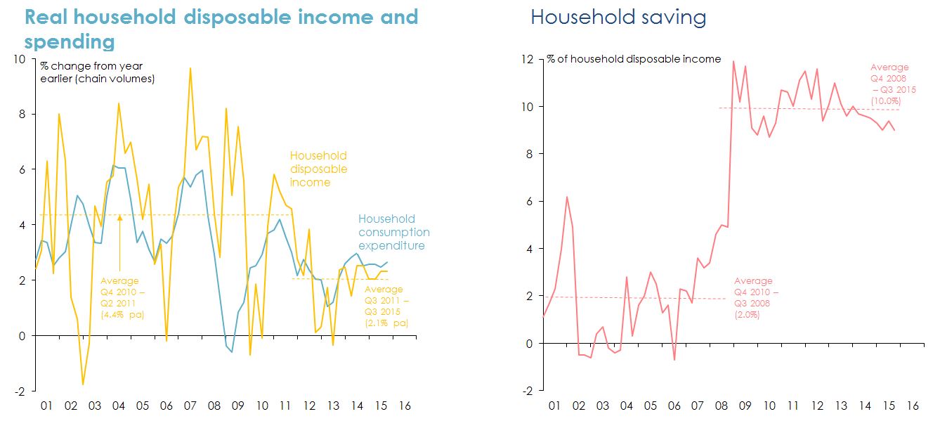
Figure 30: Measures of growth in household income. Source: ABS.
Sustained low inflation gives the RBA ‘room’ to cut interest rates again ‘if needed’ – but it probably won’t be.
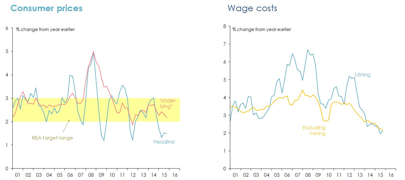
Figure 31: Measures of inflation. Source: ABS Reserve Bank of Australia.
The A$ is likely to fall further as the US$ and US interest rates rise, and commodity prices continue to decline.
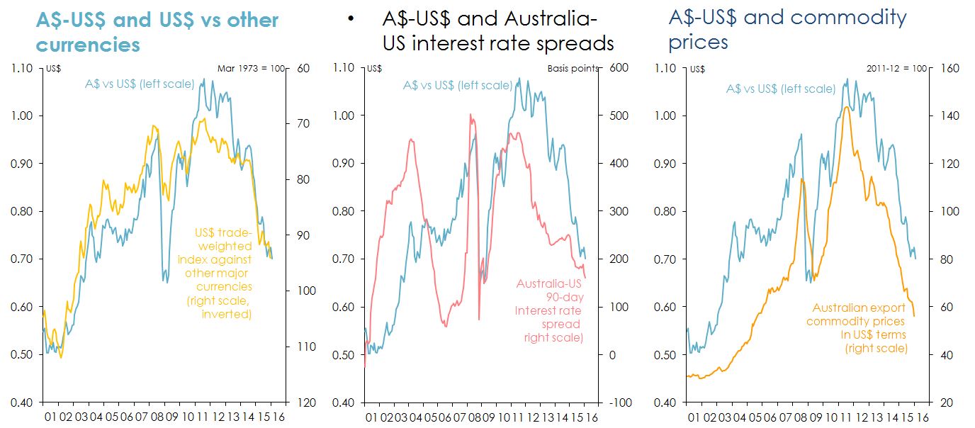
Figure 32: Currencies, interest rates and commodities of Australia versus US. Sources: Thomas Reuters; US Federal Reserve; Reserve Bank of Australia.
The opportunity for Australian agriculture
The numbers and spending power of ‘Asian middle classes’ will increase dramatically over the next 15 years.
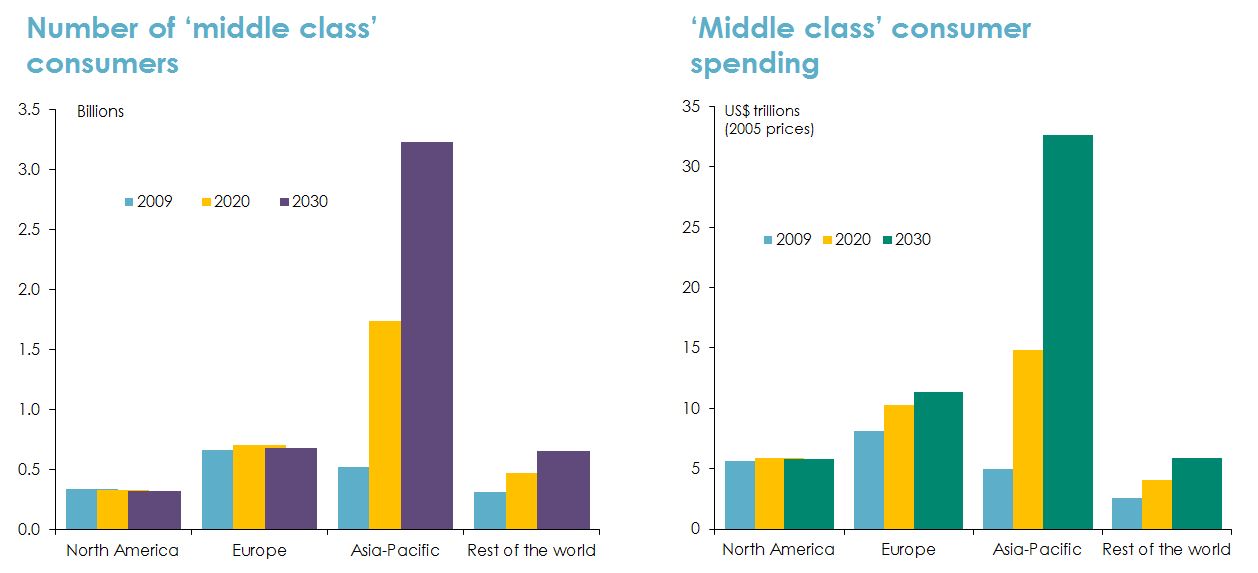
Figure 33: Growth in ‘Asian middle class’. Note: 'Middle class' is defined as people with daily spending of between US$10 and US$100, in 2005 prices converted at purchasing power parity exchange rates. Source: Homi Kharas and Geoffrey Gertz, 'The New Global Middle Class: A Cross-Over from West to East', Wolfensohn Centre for Development, The Brookings Institution, Washington DC, 2010.
But Asia’s potential to lift agricultural production is limited by constraints on both land and water …
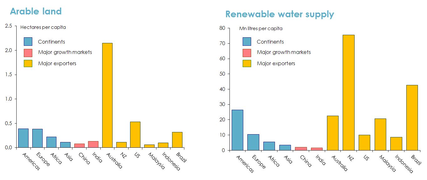
Figure 34: Australia’s arable land and water supply relative to other countries. Source: ANZ and Port Jackson Partners, Greener Pastures: The Global Soft Commodity Opportunity for Australia and New Zealand, October 2012.
… so the growth rate of agricultural production is likely to slow –especially in Asia.
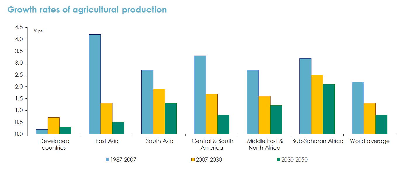
Figure 35: Growth rate of agricultural production for a number of countries. Source: Nikos Alexandrators and Jelle Bruinsma, World Agriculture Towards 2030/2050: The 2012 Revision, ESA Working Paper No 12-03, Food and Agriculture Organization (June 2012).
… and Asian countries (in particular) will need to import a lot more food products.
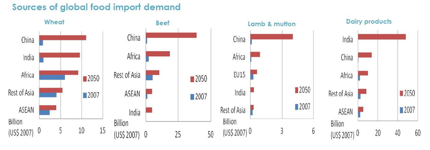
Figure 36: Asian imports. Source: Verity Linehan, Sally Thorpe, Neil Andrews, Yeon Kim and Farah Beaini, Food Demand to 2050: Opportunities for Australian Agriculture, Paper presented to 42nd ABARES Outlook Conference, 6-7 March 2012; Australian Government, Australia in the Asian Century White Paper, October 2012.
The three ‘Free Trade Agreements’ completed last year do create some real opportunities for Australian agricultural producers
- No ‘Free Trade Agreement’ ever produces genuinely ‘free’ trade and some of the ones Australia has signed in recent years (e.g. with the US or Thailand) didn’t do much for Australian exporters.
- However the agreements signed last year with Korea, Japan and China are genuinely ‘good’ agreements which open up genuine opportunities for Australian exporters, including agricultural exporters.
- The agreement with Korea:
- immediately abolishes Korean tariffs on Australian sugar, wheat and wine.
- provides duty-free access for seasonal horticultural products (such as potatoes).
- phases out tariffs on beef, sheep meat, pork, and dairy products over periods of between three and 13 years (in most cases).
- The agreement with Japan:
- provides for fairly swift reductions in tariffs on beef (though not complete elimination).
- institutes duty-free quotas for cheese and milk protein concentrates.
- allows greater access for a range of horticultural products (especially seasonal ones).
- The agreement with China:
- provides for the phasing out of tariffs on beef, all dairy products, sheep meat, pork, fruit & vegetables over 2-9 years.
- and for a duty-free quota of 30Kt of wool growing to 44Kt 2024, in addition to Australia’s existing access under a global 287Kt quota cases).
But to capitalize on that opportunity, Australian agriculture will need to improve its productivity …
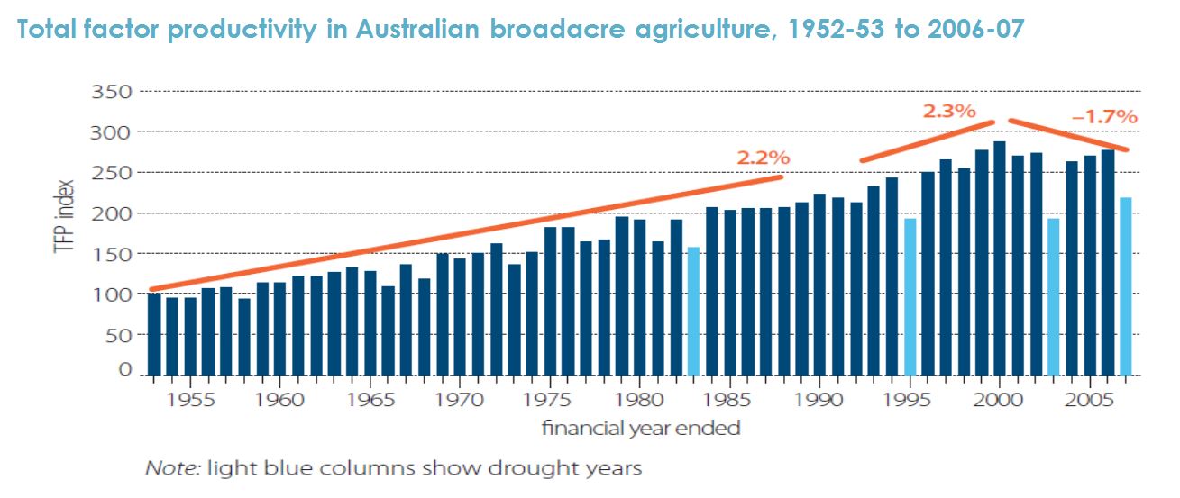
Figure 37: Productivity of Australian agriculture from 1952 to 2007. Note: Total (or multi-) factor productivity is the ratio of total production to a measure of inputs (land, labour, capital, and materials and services) used in the production process. Source: Yu Sheng, John Dennis Mullen and Shiji Zhao, A Turning Point in Agricultural Productivity: Consideration of the Causes, ABARES Research Report 11.4, May 2011.
… and attract new capital investment, (inevitably) including from foreign sources.
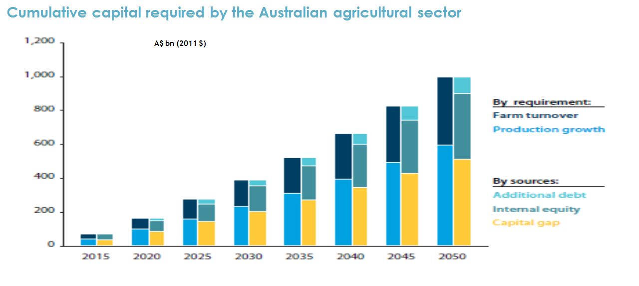
Figure 38: Capital investment required by Australian agriculture. Source: ANZ and Port Jackson Partners, Greener Pastures: The Global Soft Commodity Opportunity for Australia and New Zealand, October 2012.
Productivity growth has slowed across most major Australian agricultural sectors, except sheep farming, since 2000.
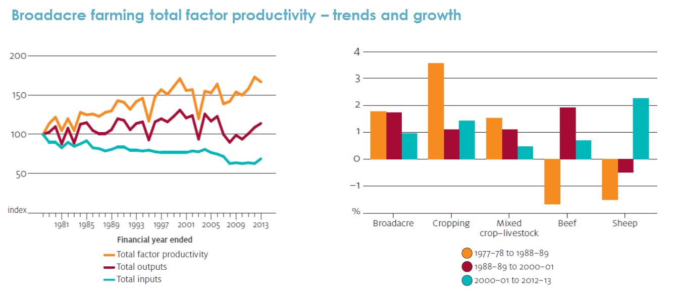
Figure 39: Growth of productivity for the major Australian agricultural sectors. Source: Tom Jackson, Astrid Dahl and Haydn Valle, 'Productivity in Australia's broadacre and dairy industries, in ABARES, Agricultural Commodities, March quarter 2015.
Although it’s not the only factor, farm size does have a significant influence on productivity.
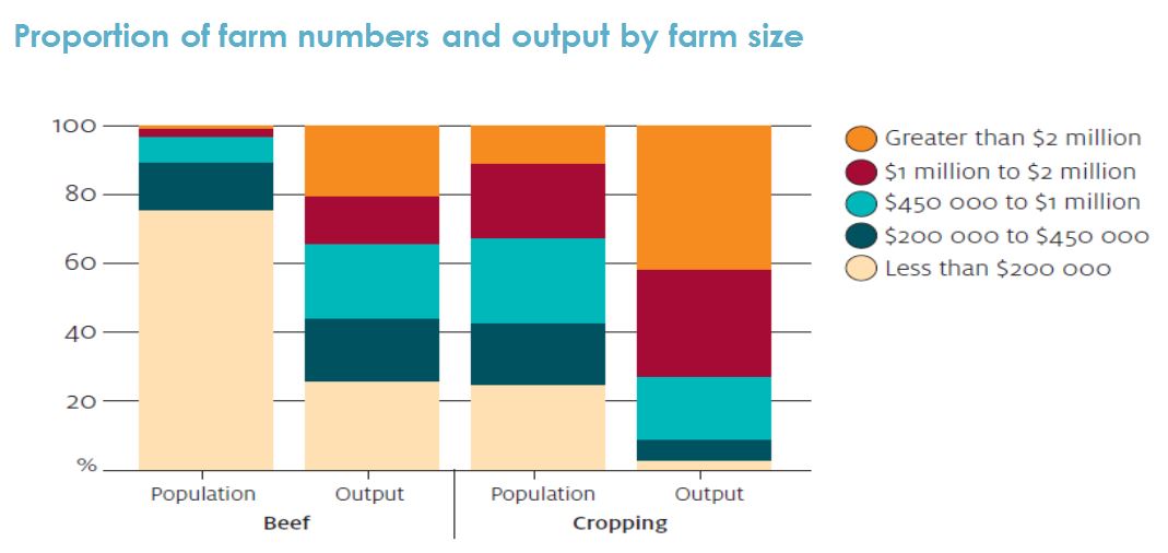
Figure 40: Influence of farm size on productivity. Note: Farm size is measured by total receipts in 2012-13. Source: Tom Jackson and Haydn Valle, 'Profitability and productivity in Australia's beef industry', ABARES Agricultural Commodities, March quarter 2015.
Farm size also has an important bearing on profitability, and hence on the capacity to invest in productivity improvement.
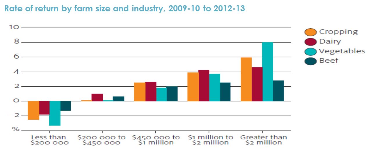
Figure 41: Rate of return by farm size and industry. Note: Farm size is measured by total receipts in 2012-13. Source: Tom Jackson and Haydn Valle, 'Profitability and productivity in Australia's beef industry', ABARES Agricultural Commodities, March quarter 2015.
Summary
- The ‘advanced’ economies have been recovering from the global financial crisis at different rates.
- the US (and the UK) have been doing better than the euro zone and Japan.
- the US Federal Reserve wants to continue gradually returning monetary policy settings towards ‘normal’ but the European Central Bank and the Bank of Japan will continue with zero rates and ‘money printing’ for much longer.
- the US dollar is likely to continue rising.
- By contrast most ‘emerging’ economies – apart from India - are slowing.
- China’s growth is slowing, and the composition of Chinese growth is shifting away from resource-intensive sectors.
- higher US interest rates and a stronger US$ represent a key risk to ‘emerging’ economies with a lot of debt.
- weaker ‘emerging’ economies in turn pose risks for the ‘developed’ world.
- Australia’s ‘resources boom’ is rapidly fading away.
- resources exports are continuing to rise, but at lower prices and with less employment.
- Record-low interest rates and a lower A$ are giving some support to the rest of the Australian economy.
- growth in labour-intensive sectors like home-building, tourism, health and aged care is keeping a lid on unemployment.
- but household income growth remains weak, and hence so does business investment.
- The Reserve Bank doesn’t want to cut interest rates again – but the A$ will fall some more.
- Rapid growth and rising living standards in Asian economies presents enormous opportunities for Australian agriculture.
- but Australian agriculture needs to attract capital and boost productivity to capture them.
Contact details
Saul Easlake
Economist