NDVI is only part of the story
NDVI is only part of the story
Author: Ben Boughton, Satamap Pty Ltd, Gilroy Farms, 2014 Nuffield Scholar (UAVs) | Date: 21 Jul 2016
Take home message
It is important to understand that when imagery is collected there is a broad range of ways it can be used.
Remotely sensed imagery such as satellite imagery (or UAV but varies) is usually first delivered in individual spectral bands such as blue, green, red, near infrared, short wave infrared etc. Using these bands you can then construct all sorts of visualisations and do further calculations. All these examples came from one image capture from the Sentinel 2 satellite on 13 Feb 2016. Location is north of Goondiwindi. It is most likely cotton – but this is just assumed. These are few products that can be generated from a single satellite image acquisition.
1. True colour (natural colour)
Combining blue, green and to create a colour image that recreates the world as our eyes see it. The red square is the paddock we will focus on.
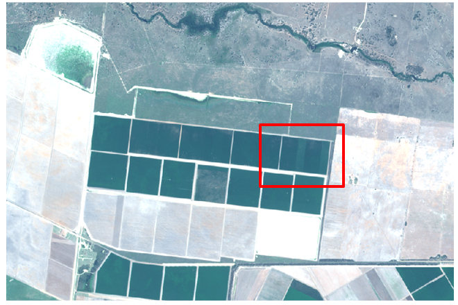
Figure 1. True colour image
2. False colour
Use the above principles but put the 'wrong' bands in the expected colour space. In this example we still combine a version of blue, green and red but the difference is red displays near infrared, green displays red and blue displays green. It sounds confusing but the addition of the near infrared band in the red colour space responds better to chlorophyll highlighting crop variability.
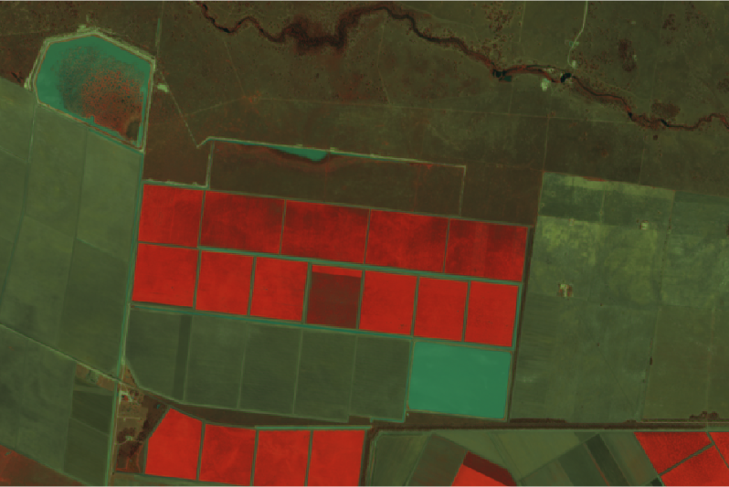
Figure 2. False colour image
3. Individual bands
We can take an individual band and stretch the reflectance values over a defined colour ramp. If we consider the following colour ramp:
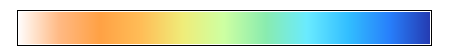
Figure 3. Colour ramp
This is a ‘haxby’ colour chart that has been reversed: low reflectance in white-orange, through to high up in the blue.
If this is printed in black and white – light is low, and dark is high.
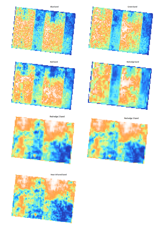
Figure 4. Different colour bands
Notice how each band gives us difference information about the crop, particularly near infrared and red-edge.
*Note imagery has not been atmospherically corrected which is probably why the blue band looks messy. The blue band is the hardest to capture well because our atmosphere does a good job at scattering blue light.
4. Vegetation indices
We can take the imagery one step further and start to apply vegetation indices which involve taking the some individual bands into a known formula to expose more information and/or try correlate with a certain physical attribute.
Most vegetation indices exploit the almost reverse spectral response between red and near infrared.
The most famous of these is Normalised Difference Vegetation Index (NDVI) which is given by the formula:
(near infrared – red) / (near infrared + red)
This generates a map with each pixel given a value between -1 and 1. As we did with the individual bands above we will apply the reverse haxby colour ramp:
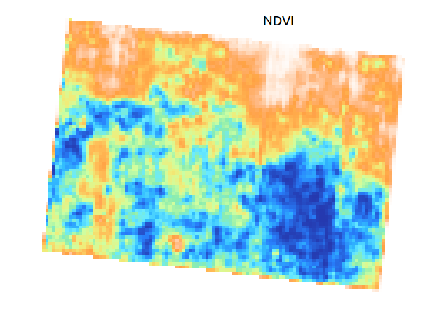
Figure 5. Image created using the NDVI
Of course NDVI is not the only vegetation index. Here are a few others including two band Enhanced Vegetation Index (EVI2) and Modified Triangular Difference Vegetation Index 2 (MTVI2).
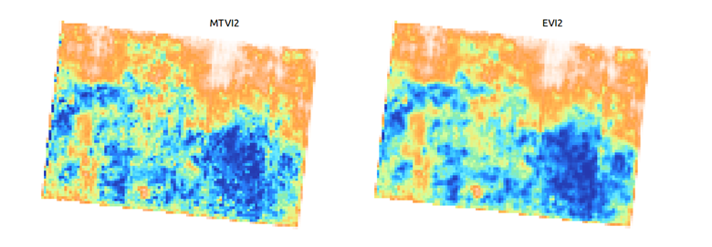
Figure 6. Images created using the EVI2 and the MTVI2
They all appear quite similar when viewed side by side with only small differences as they all work off the same principle as NDVI.
Discussion and conclusion
You should now understand the building blocks of remotely sensed imagery.
If you were to just look at the NDVI map you would get a good understanding of high and low biomass areas and it would give you indication of which areas need your attention. In this particular example, when you look at any of the colour bands in isolation it is evident that there is a management driven function contributing due to the obvious sections. Without a ground truth we would never really know what is going on.
Often we see this sort of effect if half a paddock is sprayed with a selective herbicide. This can change the leaf angle on the target species (i.e. spraying Tordon 242 in a wheat crop temporarily changes leaf angle visible in colour bands but not vegetation index such as NDVI).
The red-edge band sits in between red and near-infrared and offers valuable insights into plant physiology such as chlorophyll content. Sentinel 2A offers 3 different red edge bands that could offer valuable information. If you look at the individual bands above you will see the first red edge band is most similar to red and the 3rd is most similar to near infra-red which reflects where these bands sit in the spectrum. This seems to show up variability not seen in the other bands. Just by looking at the data we do not know what is causing this variability but it is an area ripe for investigation. RapidEye is a different satellite constellation from our example but this paper offers further explanation into red edge: http://www.blackbridge.com/rapideye/upload/Red_Edge_White_Paper.pdf .
There are other uses for this imagery. For example, if you take two separate dates, it is possible to generate a change map to see which areas of paddock have gained (or loss) relative biomass.
Understanding the building blocks is one thing, but to make this effort worthwhile consider some of the practical uses for imagery. The accuracy and effectiveness of these can vary but overall the list seems to be getting longer all the time. The more it is in the hands of agronomists and farmers, the more uses are discovered.
Practical uses for imagery include:
- Tracking crop growth within seasons and compare crop growth between seasons.
- Yield forecasting
- Readily identifies areas of average, better than average and below average growth so that inspections and solutions are more targeted.
- Identifying resistant weeds
- Creating variable rate maps
- Irrigation scheduling.
- Identifying inaccurate irrigation in areas/zones
- Emergence and or gappiness maps particularly for replanting
- Identifying better field layouts and areas that are not profitable to farm
- Benchmarking across localities and regions
- Tracking previous crop performance when purchasing properties
- Targeted insecticide applications
- Targeted fertiliser applications
- Harvest timing
- Overall tracking of crops and yield forecasts over farms spread across regions or across Australia
- Picking trends and successful strategies across clients
- Understand crop areas and crop status to help with input forecasting
- Understanding crop dynamics and tracking hail/storm/drift events
- Tracking pasture growth and utilisation
- Crop forecasting and resource management
- Crop growth and yield forecasting on a regional basis and an Australia wide basis
- Using historical data to assess trends
- Tracking fertility especially different fertiliser regimes and the effect of previous crops and the waterlogging et cetera
- Formulating top dressing strategies
- Mapping out areas of high growth for fungicide and growth regulator application.
- Tracking herbicide damage and off target drift
- Assessing trials
- Assessing potential paddock yields for marketing strategies and insurance purposes
It is important to understand that when imagery is collected there is a broad range of ways it can be used. We have only scratched the surface here.
Contact details
Ben Boughton
Mb: 0428548688
Email: ben@satamap.com.au