Linking remote sensing and climate data with variations in crop yield and soil constraints across paddocks
Linking remote sensing and climate data with variations in crop yield and soil constraints across paddocks
Author: Thomas Orton, Yash Dang and Neal Menzies (University of Queensland) | Date: 03 Mar 2020
Take-home messages
- There is useful information in historic remote-sensing data, but the data requires considerable processing and analyses
- Data on factors influencing the variation of yields, in particular soil constraints and seasonal rainfall, can help interpret any consistent spatial patterns of within-field yield variation
- We are developing a web-based tool to process the data and make the information easily accessible and interpretable
- The tool should provide growers with better knowledge of past performance and of consistent spatial patterns of yield variation that could be attributable to soil constraints.
Introduction
Better knowledge and understanding of the variation of past crop yields (both spatially across a paddock, and temporally from season to season) can help growers make better management decisions to improve yields in future. Information about the most important drivers of this variation can provide further help. The remote-sensing data compiled from earth-observing satellites provides a valuable information source. In particular, the Landsat series of satellite images (Landsat 5, 7 and 8) provide a consistent set of data dating back to the 1980s. These provide a good opportunity to look at consistent patterns through time – that is, spatial patterns of yield variation that repeat season after season. Such consistent patterns might imply the presence of some kind of soil constraint limiting yields in parts of the field.
For the remote-sensing data to be useful to growers, there is a substantial amount of processing involved:
- Accounting for atmospheric effects and the removal of clouds from each image
- The selection of the most relevant images (from a time series of images) and the calculation of an appropriate index to represent the property of interest in any given growing season (yield)
- Statistical analyses of the resulting dataset.
The aim of the work in this project is to develop a web-based tool that growers can use to look at past crop yields in their paddocks and detect any consistent spatial patterns. Along with the processing and analysis of the remote-sensing data, the tool will compile and present past rainfall data and maps of soil constraints. The data on these driving factors could help the user to interpret the variation shown by the remote-sensing data. The tool will aim to make the analysis easy to use and interpret.
Here, we present work towards the development of this tool, and illustrate the type of information it will provide. The illustration is described as a number of steps, some of which the user of the tool will follow, and others which describe the processing and output of the tool.
Illustration
1. The user inputs the field boundary
The user inputs the field boundary on a map in a web browser. For example, Figure 1 shows the field boundary for a field (called Grandview) at a farm near Biloela, Queensland, which will be used as an illustration.
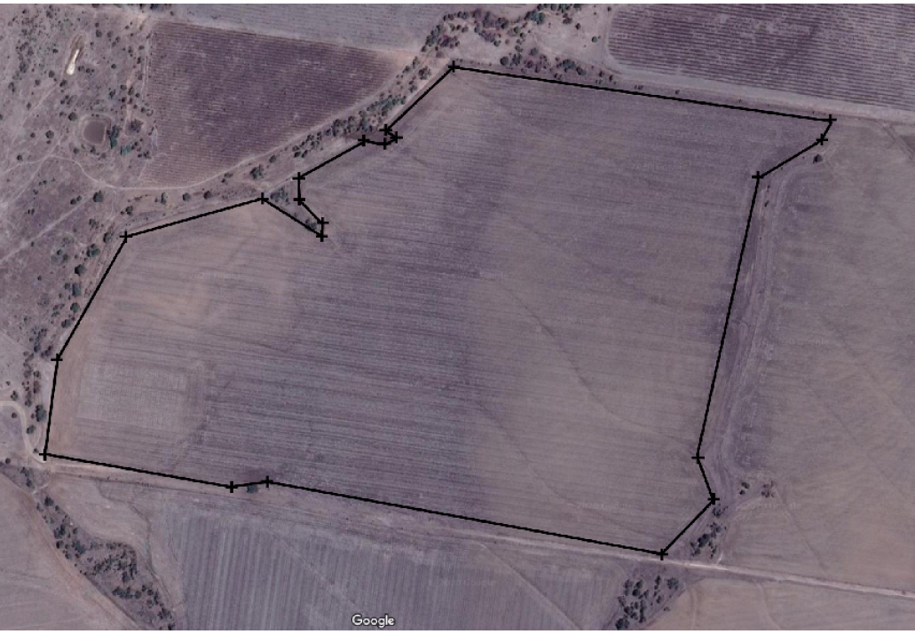 Figure 1. The Grandview field boundary, which will be used as an illustration site; the user will enter this boundary by navigating and clicking the boundary points on a map
2. Remote-sensing data are collated and analysed to give a yield index for each growing season
When the user has entered the field boundary, the remote-sensing data from within the field boundary are compiled and analysed; maps are presented of a yield index for each growing season dating back to 1999 (Figure 2). To produce each of these maps, time series of images are compiled for each season (not shown here), and images from close to the time of maximum biomass used to calculate a vegetation index, which correlates with yield. For each growing season, the time series is also analysed to determine whether there is enough information to conclude that a winter crop was grown; if so, then a tick is displayed next to the map, else a cross is displayed. The user will have the chance to unselect certain years, for instance years where it is evident that the field was split into different management zones (so that when summarising the long-term results, spatial variation due to management differences within the field does not get confused with spatial variation due to soil constraints). Only maps for the ticked years will be considered in further analysis. It should be noted that the maps show spatial variation within the field in any given season but cannot be used to compare yields across different seasons.
Also shown next to the map for each winter growing season is the growing-season available water, defined here as a third of the preceding summer rainfall plus the current winter rainfall (French and Schultz, 1984). A recent study (Chen et al., 2019) used this as a variable to summarise climate in a simple model for predicting wheat yield, with peak yields predicted to occur at around 450 mm, and 25% reductions from the peak yield predicted at around 300mm; in the plots, the growing-season available water is shown on a scale of 0-600 mm and is filled light blue or orange, depending on whether the growing-season available water fell above or below 300mm. Although this information is presented here, it is not currently used by the tool, but is something that will be developed further during the course of the project.
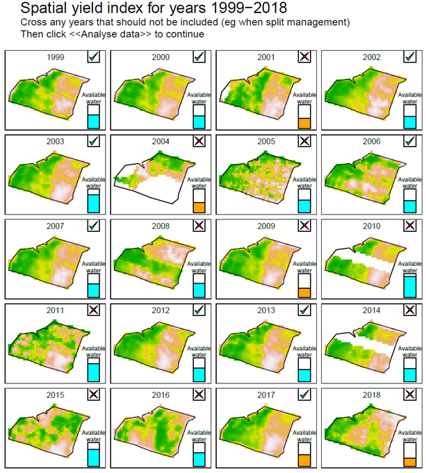 Figure 2. The yield index based on analysis of the remote-sensing data for the 20 growing seasons from 1999 to 2018. Ticked years indicate when there was sufficient evidence in the remote sensing data to conclude a winter crop was grown, crossed years indicate when the data did not support this conclusion. Available water, defined as a third of the preceding summer rainfall plus the season’s winter rainfall, is also shown, on a scale of 0-600mm, and coloured orange when less than 300mm.
3. The produced yield index data for all growing seasons are analysed and any consistent spatial patterns shown
The data from the ticked years are summarised by a map of the mean for each pixel, and a statistical analysis is applied to each pixel to determine whether there is evidence that it has been consistently high or low yielding. This splits the field into three categories; consistently high, consistently low, and moderate (Figure 3).
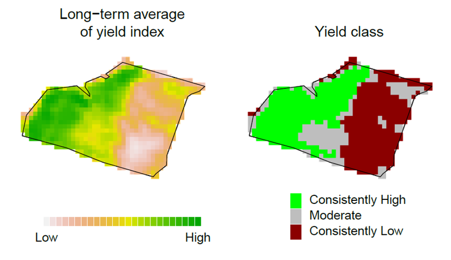 Figure 3. Maps summarising the long-term average of the yield index (over all cropped years) and its classification into consistently high and low yielding areas.
4. Soil maps based on legacy datasets are displayed for comparison
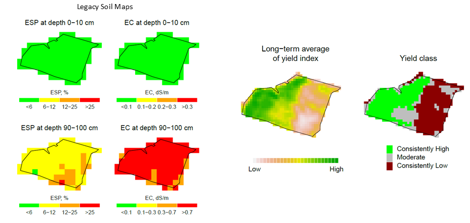
Also shown by the tool are maps of soil constraints (Figure 4; Orton et al., 2020; Lai et al., 2020), produced based on ‘legacy’ soil data (data collated from state and CSIRO soil databases; Searle, 2014), as well as data on ‘environmental covariates’ (climate, terrain, radiometric surveys, soil order maps). For illustration, Figure 4 shows predictions of exchangeable sodium percentage (ESP, for soil sodicity) and electrical conductivity (EC, for soil salinity) across the field, although information for other soil constraints will also be available in the tool. The soil maps are shown next to the long-term yield summary maps, to allow comparison. The maps of the soil constraints provide the user with some background information, but because they are produced based on legacy data (perhaps the nearest soil profile measurement being from another farm), it is unlikely that they will provide the grower with new knowledge of the field.
5. The user has the opportunity to input their own local soil data, and the legacy maps are then updated
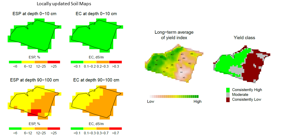
To provide more useful local information on the spatial variation of soil constraints within the field, the user will have the option of entering their own local soil data, which will be used to update the soil maps that were produced based on the ‘legacy’ soil datasets. This feature will allow the user to get the most out of all information sources (legacy and local data and the relationships between the soil constraint and the environmental covariates). For the illustration site, the updated maps are shown in Figure 5, again shown next to the long-term yield summary maps. In this example, the maps of both subsoil ESP and subsoil EC show similar spatial patterns to the map of the long-term average of the yield index, suggesting that these soil constraints might be causing the within-field yield variation.
6. If local data are inputted, the tool also displays and compares soil profiles in high and low yielding areas.
If the user has inputted their own soil data, then the tool will allow comparison of soil profile plots for profiles that fall in the different yield classes. Figure 6 shows the illustration, with local data on ESP, EC and soil chloride (Cl). The most notable differences between the low-yielding and high-yielding areas of the field are below 50cm in the soil profile, with the low-yielding profiles being characterized by higher values of subsoil ESP, EC and Cl.
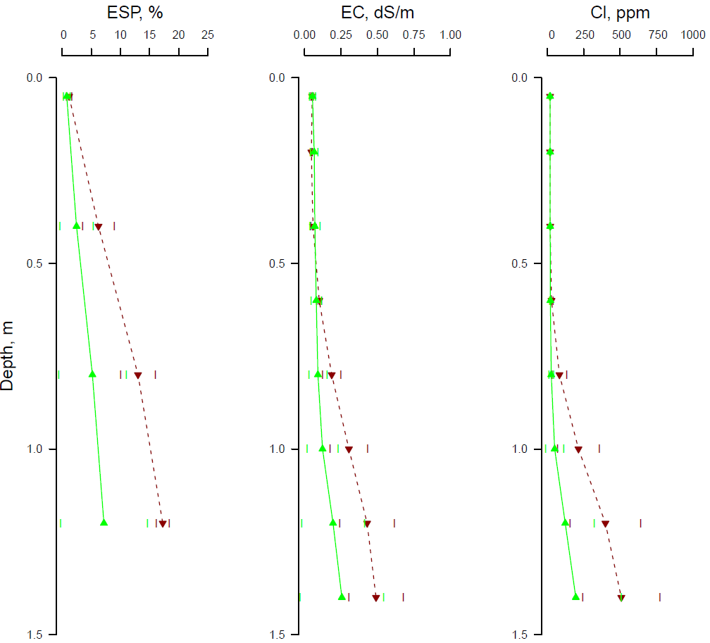 Figure 6. Average soil profile data from within consistently high yielding (green solid lines) and consistently low yielding (dark red dashed lines) areas. Measured soil constraints shown are exchangeable sodium percentage (ESP), electrical conductivity (EC) and soil chloride concentration (Cl).
How can the tool help growers?
Identification of consistently poor yielding areas of a field can help growers to target further soil sampling to better understand the factors causing this yield variation. If local soil data can explain the spatial patterns of yield variation, then appropriate amelioration strategies can be considered, which is the focus of work in another linked GRDC project. In many cases, the tool might only serve to confirm what the grower already knows, while in other cases the tool might provide valuable new insight.
Further work
Over the remainder of the project, we will look at:
- Refining and validating the yield index so that it better represents yield in any given season
- Whether there is evidence that the spatial variation of yield is different in wet and dry years, with less impact of soil constraints being expected in years when there is sufficient in-season rainfall; this feature could be added to the tool in future
- Correlating the remote-sensing data with the soil data and rainfall data statistically, to see if this can provide improved predictions of soil constraints leading to yield loss
- Improving the legacy soil maps by including more recently collected soil data and satellite-based covariates
- Building the computer code into a web-based application.
References
Chen K, O'Leary RA and Evans FH, (2019). A simple and parsimonious generalised additive model for predicting wheat yield in a decision support tool. Agricultural Systems 173, 140–150.
French RJ and Schultz, JE (1984). Water Use Efficiency of Wheat in a Mediterranean-type Environment. I. The Relation between Yield, Water Use and Climate. Australian Journal of Agricultural Research 35, 743–764.
Lai YR, Orton TG, Pringle MJ, Menzies NW and Dang YP (2020). Increment-averaged kriging: a comparison with depth-harmonized mapping of soil exchangeable sodium percentage in a cropping region of eastern Australia. Geoderma 363, 114151.
Orton TG, Pringle MJ, Bishop TFA, Menzies NW and Dang YP (2020). Increment-averaged kriging for 3-D modelling and mapping soil properties: Combining machine learning and geostatistical methods. Geoderma 361, 114094.
Searle R (2014). The Australian site data collation to support the GlobalSoilMap. In GlobalSoilMap: Basis of the global spatial soil information system, Eds: Arrouays D, McKenzie N, Hempel J, de Forges ACR, McBratney A. CRC Press, The Netherlands.
Acknowledgements
The research undertaken as part of this project is made possible by the significant contributions of growers through both trial cooperation and the support of the GRDC, the authors would like to thank them for their continued support. The authors also thank Darren and Tanya Jensen for providing data for use in the illustration. Landsat imagery was supplied by the United States Geological Survey. The support and resources provided by the Queensland Remote Sensing Centre, Department of Environment and Science is also gratefully acknowledged.
Contact details
Thomas Orton
The University of Queensland
School of Agriculture and Food Sciences, St Lucia, Queensland 4072, Australia
Ph: 07 3170 5772
Email: t.orton@uq.edu.au
GRDC Project Code: UOQ1803-003RTX,
