Forewarned is forearmed: new forecasts for agriculturalists
Author: Dale Grey (Agriculture Victoria), Kate Finger (Birchip Cropping Group) | Date: 08 Feb 2022
Take home messages
- A range of new outlooks for the weeks to months ahead, with richer detail, are becoming available from the Bureau of Meteorology.
- Some products are currently live, but others will become available over 2022.
- A forecast that is more insightful than chance of above median is now a reality.
Background
New forecasts from the Bureau of Meteorology's ACCESS-S model have been developed to give insight to hotter, cooler, wetter or drier conditions out weeks, fortnights and months. This work provides more detailed information of upcoming conditions and is focussed on the period beyond the 7-day weather forecast. New forecasts of extreme conditions are now available on the Bureau website. These predictions of extremes are specifically looking at the chances of receiving decile one and two events or decile nine and ten events. It is hoped that these forecasts will allow growers to plan farm operations in the murky zone past the weather forecast, for planting, harvesting, topdressing and haymaking logistics. Predictions are available for rainfall, and maximum and minimum temperature.
The new products are seamlessly embedded into the existing Bureau climate outlooks graphical forecasts (Bureau of Meteorology) ) and have a ‘click on your location’ feature. For the first time ever, growers will be able to get a decile range forecast for rainfall to provide more detail than the current chance of above median forecast. Additional products will be made available to the public later this year. The forecasts are based on a total of 99 separate model runs. This is needed to account for uncertainty in the way that the weather will evolve and allows the outcome to be plotted in a probabilistic fashion (for example, what percentage of the runs predict a certain outcome). As with all probabilistic forecasts, they never tell you exactly what will happen but show the range of odds of various amounts of rainfall or temperature occurring. When all the model runs are stacked up in a particular direction, you can be confident that the overarching climate and weather setup is causing that to happen; but just like 100:1 chances can win horse races, so too can unlikely events occur in weather and climate. Many times, though, forecasts show a great spread (or neutral) forecast which some people falsely interpret as average being the most likely. This is not correct, as such forecasts more correctly show that anything is possible. Forecasts such as these are not worth agonising over. Recently, the ACCESS-S1 model was updated to the S2 version, which has a number of improvements and ‘Australianisation’ of some parameters. This includes in-house Bureau inputs of the ocean and the soil moisture for the start of the forecast, which are improvements on the original UK Meteorological Office data that was used in ACCESS-S1.
The NEW tools
There are five new products that will be listed on the Bureau website over 2021-22.
Product #1
The first product is maps showing the chance of having extreme rainfall, maximum temperatures or minimum temperatures for the weeks, months and seasons ahead. These maps are a natural extension of the Bureau’s currently available ‘probability of above median’ maps and show the chance of having very wet, dry, hot or cold conditions. For example, Figure 1 shows the forecast issued in January 2022 for the February to April period and the chance of having an extremely dry next three months. For these maps, ‘extreme’ has been defined as being amongst the driest, wettest, hottest or coldest 20% of periods (weeks/months/seasons) from the climatological (historical) period (that is, deciles 1 and 2 (bottom 20%) or deciles 9 and 10 (top 20%)). This product went live in November 2021.

Figure 1. Extreme rainfall map. Example of the chance of having an extremely dry Feb-Apr 2022 (amongst the bottom 20% in the climatology period). The forecast shown here is suggesting a low risk of having decile 1 or 2 rainfall totals over much of Australia (probabilities are less than the usual risk of 20% over large areas). In yellow, there is an increased chance of drier (decile 1 or 2 rainfall) in the SW quarter of Victoria.
Product #2
The second product is the ‘decile bars’. These are location-specific bars that indicate the shift in the probabilities compared to usual across the deciles. They are available for rainfall, and maximum and minimum temperatures for the weeks, months and seasons ahead. Figure 2 shows an example of the bars for a forecast of three-month rainfall. These were one of the most popular products that arose from consultation with producers and advisors. This product went live in November 2021. For the first time in Australia, more detailed information is available on the forecast, rather than just ‘chance of above median’.
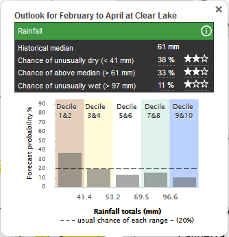
Figure 2. Decile bars. Rainfall forecasts for Feb-Apr in the Wimmera (generated on 13 January 2022). The forecasts show the probabilities across five different decile ranges. The long-term average probability (‘usual chance’) for each category is 20% and the forecasts show the shift in the odds compared to usual. For example, the odds are showing a swing to drier being almost twice as likely, with about double the usual risk of having decile 1 or 2 rainfall (that is, being amongst the bottom 20% of driest Feb-Apr). Importantly, it can be seen that every other outcome is still on the table, just that the chance of decile 9 and 10 rainfall has halved and would be less likely. It is common for forecasts to show 20% chances of each decile range which is what is termed a neutral forecast. The stars give a representation of the historic skill of the forecast, the more stars the better the skill. Explanation of the methodology and its interpretation can be found, by pressing the ⓘ button
Product #3
The third product is the ‘climagram’. These are location-specific timeseries graphs showing the forecast of rainfall totals, and maximum and minimum temperatures respectively for the coming weeks and months (Figure 3). Past observations are also shown on the graph. Insight from producers and advisors really drove the creation of this product due to the strong desire to visualise the forecast as a time-series for a given location (rather than having to look at multiple maps). The forecasts of rainfall totals and temperatures (rather than departures from normal) facilitates flexibility for temperature/rainfall threshold-specific decisions. The week one forecasts of all products importantly includes the actual weather forecast, which is much more accurate at predicting short term rainfall and temperature than using the first week of the climate model forecast. This product is in its final stages of testing before going live.
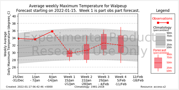
Figure 3. Climagram. Timeseries of observed (red solid line) and forecast (red box plots) maximum temperature (y-axis) for consecutive weekly periods (x-axis) for Walpeup. The box plots indicate the range in the expected outcomes from the forecasts. The grey shading indicates the usually expected temperatures for that time of year (based on 1981-2010). The thresholds shown for the box plots and the grey shading are the 10th, 25th, 50th (median), 75th and 90th percentiles. For example, Week 1 (15 Jan–21 Jan 2021) is forecast to have a weekly mean maximum temperature of around 29.8°C (the median of the forecasts), which is around 2°C cooler than usual (for example, the median line of the box is below the median line of the grey shading and is around the 25th percentile of usually expected temperatures). Week 2 is also possibly going to be cooler but with greater spread from the model. In contrast, in Week 3 temperatures are expected to return to close to usual, with a weekly mean maximum temperature of ~32°C (that is, the median of the forecasts is close to the historical median). The display of the product shown here is from the R&D prototype. Work is progressing to enhance the display for the public website, and as such, the product will look slightly different when it goes live.
Product #4
Probability of exceedance (POE) graphs for rainfall are the fourth product and probably the most complex of the new tools to understand. However, once understood through the consultation process with producers and advisors, the overwhelming feedback was that this tool is valuable and will allow users to delve deeper into the forecast information. It forms part of a hierarchy of complexity of forecast tools. Insight from the producers in the reference groups indicated that for some users this information is too detailed, but for others, it could provide very useful input into their decision-making. Figure 4 shows an example of a POE forecast. The POE curves give the probability (y-axis) that different thresholds of rainfall (x-axis) will be exceeded at the location in question. The curves slope from the top left down to the bottom right, because as the rainfall totals increase, the probability of exceeding those totals decreases. The black curves are for the forecast POE and the grey curves are for the historical POE (that is, climatology). Comparing the black and grey curves indicates how different the forecast is from usual conditions. The forecast product gives users the flexibility to identify the rainfall threshold that they are interested in on the x-axis, and then read off the associated probability of exceeding that threshold on the y-axis (or vice versa). This product is in its final stages of testing before going live.
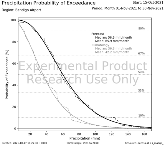
Figure 4. Probability of exceedance.Example forecast for rainfall from 15 September 2021, showing the forecast (black) and usual conditions (grey) for November 2021. The black line indicates that ACCESS-S was predicting greater chances of higher rainfall than normal at all volumes. The display of the product shown here is from the R&D prototype. Work is progressing to enhance the display for the public website, and as such, the product will look slightly different when it goes live.
Product #5
The final product is the 3-day rainfall accumulation (or ‘burst’) forecast which is a map-based product and available for multi-week forecasts (see Figure 5). The forecast product shows the likelihood (probability) of receiving a pre-selected threshold of rainfall over three consecutive days in the upcoming weeks or fortnights. This arose in discussion with growers in northern Australia where they are looking for accumulated totals from ‘bursts’ of the monsoon. It is unclear yet how this product might be used in southern States but it is plausible that it might be useful around the autumn break or hay and harvest operations. The experimental product currently has four thresholds that can be selected but it will be possible to add more thresholds. This product is in its final stages of testing before going live.
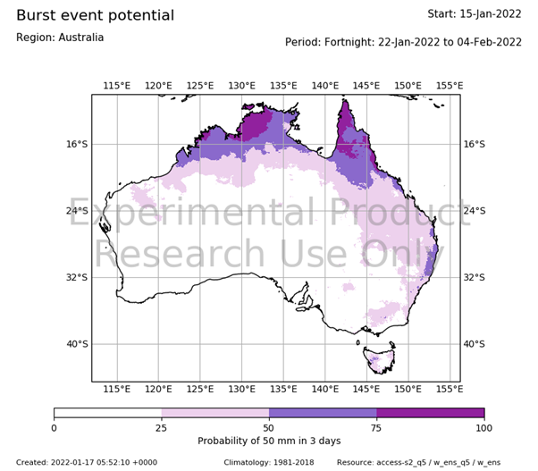
Figure 5. 3-day rainfall accumulation (burst) product. A forecast map showing the probability of receiving an intense ‘burst’ of rainfall over a short period of time. For example, in this map, parts of mountainous Victoria have a greater than 25% chance of receiving more than 50mm of rainfall in three consecutive days during a fortnight from 22 January to 4 February 2022 from a forecast made on 15 January. Higher probabilities exist in northern Australia. The display of the product shown here is from the R&D prototype. Work is progressing to enhance the display for the public website, and as such, the product will look slightly different when it goes live.
Conclusion
Growers and advisors are encouraged to familiarise themselves with the new products that come out in 2022 and to stay alert for the webinar launches and explanations of how to interpret the products.
Acknowledgements
The ‘Forewarned is forearmed’ project is funded by the Australian Government Department of Agriculture, Water and Environment, Rural R&D for Profit program. It’s led by Meat and Livestock Australia with co-investment from the grains, dairy, pork, sugar, wine and cotton RDCs as well. The project was enacted by a large consortium including the Bureau of Meteorology, the University of Melbourne, Monash University, University of Southern Queensland, SARDI, Agriculture Victoria and the Birchip Cropping Group. Producer groups from each industry (e.g., red meat, grains, dairy, etc.) were used to provide continued feedback on the actual forecast products and their visual appearance. The information in this update draws on the research and development done by several partners in the project. The authors would like to thank Debbie Hudson (Bureau of Meteorology) for a review of this article.
Useful resources
Bureau of Meteorology climate outlooks
Contact details
Dale Grey
03 5430 4395
PO Box 3100, Bendigo DC VIC 3554
dale.grey@agriculture.vic.gov.au
@eladyerg
GRDC Project Code: MLA1805-001OPX,
Was this page helpful?
YOUR FEEDBACK